Visualizing Categorical Data
Exploring Categorical Variables
This section will
- Describe distribution of a single categorical variable
- Evaluate relationship between two categorical variables
- Evaluate relationship between a categorical and a numerical variable
Frequency table & Bar plot
Let's start with a single categorical variable. A 2014 poll in the U.S. asked respondents, how difficult they think it is to save money? We can present the results of this survey in a frequency table below.
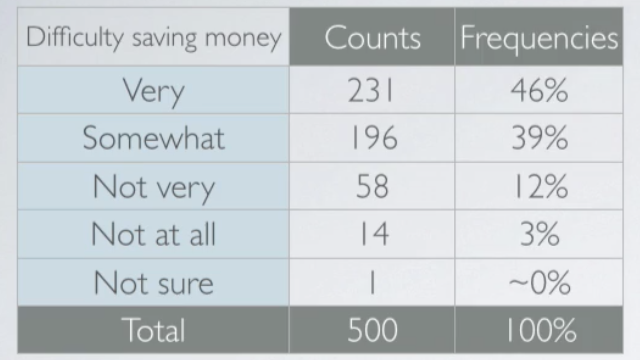
A graphical way of representing these data is bar plot. These raw counts do tell us something about the data. Most people find it more difficult than not to save money. But we usually consider the relative frequencies when evaluating the distributions of categorical variables. We can also make a bar plot of these relative frequencies, which looks just like the original bar plot but just has the relative frequencies instead of the counts on the y axis.
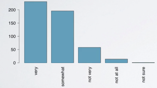
How are bar plots different than histograms?
First, bar plots are used for displaying distributions of categorical variables while histograms are used for numerical variables. Second, the axis in a histogram is a number line, hence the orders of the bars cannot be changed. While in a bar plot the categories can be listed in any order. Though some orderings make more sense than others, especially for ordinal variables.
Pie plot
It might be tempting to also make a pie chart for these data, but a pie chart is actually much less informative than a bar plot.
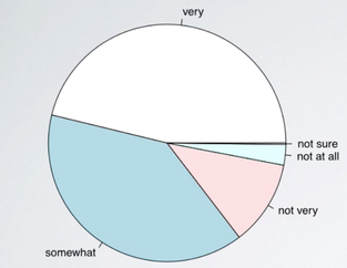
First, while it tells us the relative ordering of the levels, it doesn't actually tell us what percentage of the distribution falls into each level. Second, when there are many levels in a categorical variable with similar relative frequencies, it might be difficult to determine which level is more highly represented just by looking at a pie chart. For example, below shows a pie chart of orders of mammal species.
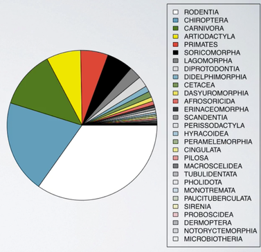
Just by looking at the pie chart, can you tell which order encompasses the lowest percentage of mammal species? It is very difficult.
Contingency Table
There is a poll asked how much income each participant makes, and we might wonder, if whether people think it's difficult, or easy, to save money, is related to their income.
To evaluate this, we organized these variables in a contingency table.
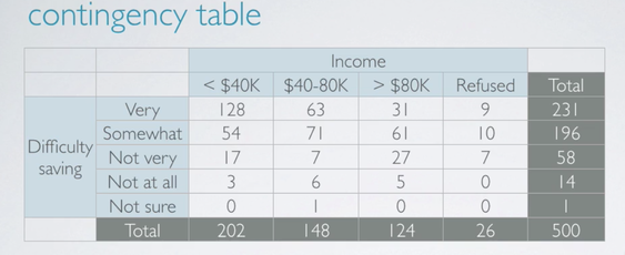
There are three levels of the income we consider.
- Less than 40,000 per year.
- Between 40 and 80,000 per year.
- More than 80,000 a year.
- There are also some respondents who refuse to answer this question.
To evaluate whether income and perception of difficulty of saving are related. We will need to compare people who think, say, it's very difficult to save money among the different income levels. But, we can't just compare these counts since the sample sizes for each income level are different.
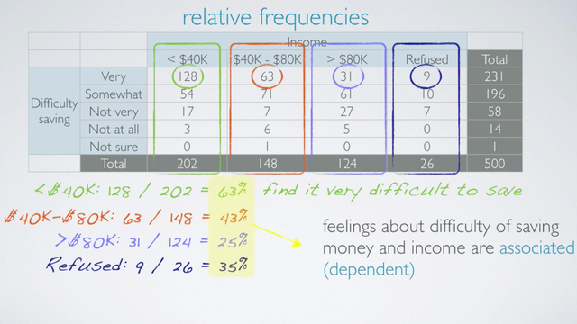
Instead, we should consider the distribution of one variable conditional on the other. To find out what percent of people who make less than 40,000 per year think it's very difficult to save money, we just consider the first column. Among the two, 202 people who make less than 40,000 per year, 128 think it's very difficult to save money, which makes up 63%. Similarly, 63 out of 148, those who make between 40 and 80,000. Or in other words, 50, 43% thinks it's very difficult to save money. And 31 over 124, only 25% of those who make more than 80,000 thinks it's very difficult to save money. For completeness, let's go through the same calculation for those who refuse to share their income as well. 9 out of 26, or 35% of those, also think it's very difficult to save money. Since the percentage of those who think it's very difficult to save money varies greatly among the different income categories. These data suggest that the two variables under consideration, feelings about difficulty of saving money and income are associated. In other words, dependent.
An obvious choice for visualizing two categorical variables is a segmented bar plot.
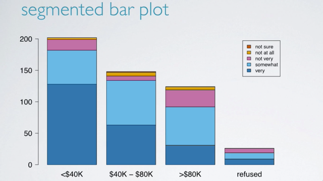
Segmented bar plots are useful for visualizing conditional frequency distributions. In other words, the distribution of the levels of one variable, the response variable, conditioned on the levels of the other, the explanatory variable. The heights of the bars indicate the number of respondents in various income categories. And the bars are segmented by color to indicate the numbers of those who think it's very difficult to save money, to not at all. Note that these are frequencies, in other words counts, and not relative frequencies. So, while segmented bar plots are useful for visualizing frequency distributions, in order to explore the relationship between these variables, we need a visualization of the relative frequencies.
So one alternative is to plot the relative frequencies.
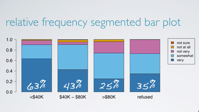
This plot basically visualizes the percentages we had calculated earlier, such as 63% of those who make less than 40,000 per year think it's very difficult to save money, etc. Another alternative is a mosaic plot.
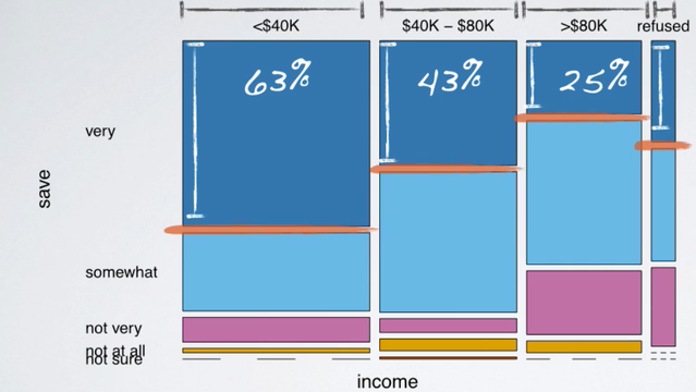
A mosaic plot like this one displays the distribution of feelings about difficulty of saving money, conditional on income as well. It also shows the marginal distribution of income too. So, let's start with the marginal distribution. The width of the bars is what's telling us about the marginal distribution of income.
Latest Post
- Dependency injection
- Directives and Pipes
- Data binding
- HTTP Get vs. Post
- Node.js is everywhere
- MongoDB root user
- Combine JavaScript and CSS
- Inline Small JavaScript and CSS
- Minify JavaScript and CSS
- Defer Parsing of JavaScript
- Prefer Async Script Loading
- Components, Bootstrap and DOM
- What is HEAD in git?
- Show the changes in Git.
- What is AngularJS 2?
- Confidence Interval for a Population Mean
- Accuracy vs. Precision
- Sampling Distribution
- Working with the Normal Distribution
- Standardized score - Z score
- Percentile
- Evaluating the Normal Distribution
- What is Nodejs? Advantages and disadvantage?
- How do I debug Nodejs applications?
- Sync directory search using fs.readdirSync