Confusion Matrix ROC Graphs
Introduction
ROC graphs are another way besides confusion matrices to examine the performance of classifiers.
ROC Space
The contingency table can derive several evaluation "metrics". To draw a ROC curve, only the true positive rate (TPR) and false positive rate (FPR) are needed (as functions of some classifier parameter). The TPR defines how many correct positive results occur among all positive samples available during the test. FPR, on the other hand, defines how many incorrect positive results occur among all negative samples available during the test.
A ROC space is defined by FPR and TPR as x and y axes respectively, which depicts relative trade-offs between true positive (benefits) and false positive (costs). Since TPR is equivalent with sensitivity and FPR is equal to 1-specificity, the ROC graph is sometimes called the sensitivity vs (1-specificity) plot. Each prediction result or instance of a confusion matrix represents one point in the ROC space.
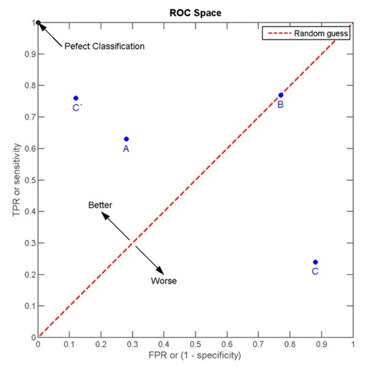
The best possible prediction method would yield a point in the upper left corner or coordinate (0, 1) of the ROC space, representing 100% sensitivity (no false negatives) and 100% specificity (no false positives). The (0, 1) point is also called a perfect classification. A completely random guess would give a point along a diagonal line (the so-called line of no-discrimination) from the left bottom to the top right corners (regardless of the positive and negative base rates). An intuitive example of random guessing is a decision by flipping coins (heads or tails). As the size of the sample increases, a random classifier's ROC point migrates towards (0.5, 0.5).
The diagonal divides the ROC space. Points above the diagonal represent good classification results (better than random), points below the line poor results (worse than random). Note that the output of a consistently poor predictor could simply be inverted to obtain a good predictor.
Example
Let us look into four prediction results from 100 positive and 100 negative instances:
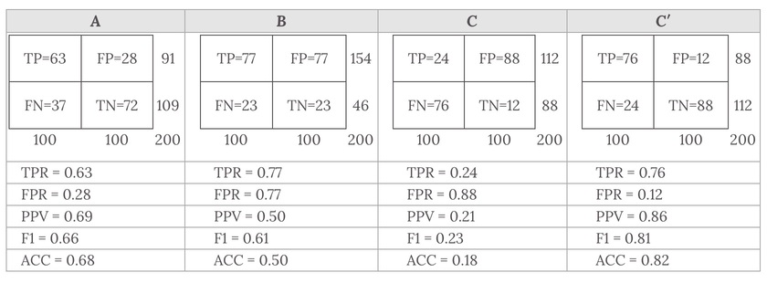
Plots of the four results above in the ROC space are given in the figure. The result of method A clearly shows the best predictive power among A, B, and C. The result of B lies on the random guess line (the diagonal line), and it can be seen in the table that the accuracy of B is 50%. However, when C is mirrored across the center point (0.5,0.5), the resulting method C′ is even better than A. This mirrored method simply reverses the predictions of whatever method or test produced the Ccontingency table. Although the original C method has negative predictive power, simply reversing its decisions leads to a new predictive method C′ which has positive predictive power. When the C method predicts p or n, the C′ method would predict n orp, respectively. In this manner, the C′ test would perform the best. The closer a result from a contingency table is to the upper left corner, the better it predicts, but the distance from the random guess line in either direction is the best indicator of how much predictive power a method has. If the result is below the line (i.e. the method is worse than a random guess), all of the method's predictions must be reversed in order to utilize its power, thereby moving the result above the random guess line.
References & Resources
- http://en.wikipedia.org/wiki/Receiver_operating_characteristic
Latest Post
- Dependency injection
- Directives and Pipes
- Data binding
- HTTP Get vs. Post
- Node.js is everywhere
- MongoDB root user
- Combine JavaScript and CSS
- Inline Small JavaScript and CSS
- Minify JavaScript and CSS
- Defer Parsing of JavaScript
- Prefer Async Script Loading
- Components, Bootstrap and DOM
- What is HEAD in git?
- Show the changes in Git.
- What is AngularJS 2?
- Confidence Interval for a Population Mean
- Accuracy vs. Precision
- Sampling Distribution
- Working with the Normal Distribution
- Standardized score - Z score
- Percentile
- Evaluating the Normal Distribution
- What is Nodejs? Advantages and disadvantage?
- How do I debug Nodejs applications?
- Sync directory search using fs.readdirSync