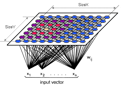
Self-organising Feature Mapping (SOM)
Introduction
Self Organizing Map (SOM) was invented by Teuvo Kohonen. It provides a data visualization technique which helps to understand high dimensional data by reducing the dimensions of data to a map. SOM also represents clustering concept by grouping similar data together. There it can be said that SOM reduces data dimensions and displays similarities among data.
With SOM, clustering is performed by having several units complete for the current object. Once the data have been entered into the system, the network of artificial neurons is trained by providing information about inputs. The weight vector of the unit is closest to the current object becomes the winning or active unit. During the training stage, the values for the input variables are gradually adjusted in an attempt to preserve neighbourhood relationships that exist within the input data set. As it gets closer to the input object, the weights of the winning unit are adjusted as well as its neighbours.
Teuvo Kohonen writes “The SOM is a new, effective software tool for the visualization of high-dimensional data. It converts complex, nonlinear statistical relationships between high-dimensional data items into simple geometric relationships on a low-dimensional display. As it thereby compresses information while preserving the most important topological and metric relationships of the primary data items on the display, it may also be thought to produce some kind of abstractions.”
Reducing Data Dimensions
Unlike other learning technique in neural networks, training a SOM requires no target vector. A SOM learns to classify the training data without any external supervision.
Data Similarity
Getting the Best Matching Unit is done by running through all weight vectors and calculating the distance from each weight and to the sample vector. The weight with the shortest distance is the winner. There are numerous ways to determine the distance; however, the most commonly used method is the Euclidean Distance or Cosine Distance.
SOM Algorithm
Each data from data set recognizes themselves by competing for representation. SOM mapping steps starts from initializing the weight vectors. From there a sample vector is selected randomly and the map of weight vectors is searched to find which weight best represents that sample. Each weight vector has neighbouring weights that are close to it. The weight that is chosen is rewarded by being able to become more like that randomly selected sample vector. The neighbours of that weight are also rewarded by being able to become more like the chosen sample vector. From this step the number of neighbours and how much each weight can learn decreases over time. This whole process is repeated a large number of times, usually more than 1000 times.
In summary, learning occurs in several steps and over much iteration:
- Each node’s weights are initialize
- A vector is chosen at random from the set of training data.
- Every node is examined to calculate which one’s weights are most like the input vector. The winning node is commonly known as the Best Matching Unit (BMU).
- Then the neighbourhood of the BMU is calculated. The amount of neighbours decreases over time.
- The winning weight is rewarded with becoming more like the sample vector. The neighbours also become more like the sample vector. The closer a node is to the BMU, the more its weights get altered and the farther away the neighbour is from the BMU, the less it learns.
- Repeat step 2-5 for N iterations.
Example from ai-junkie
To be Added
Result Interpretation
An example of the result of a Self-Organizing Map is shown below:
%202.jpg)
If the average distance is high, then the surrounding weights are very different and a dark colour is assigned to the location of the weight. If the average distance is low, a lighter colour is assigned. The resulting map shows that black is not similar to the white parts because there are lines of black representing no similarity between white parts. Looking at the map it clearly represents that the two not very similar by having black in between. It can be said that the white parts represent different clusters and the black lines represent the division of the clusters.
References & Resources
- http://blog.peltarion.com/2007/04/10/the-self-organized-gene-part-1/
- Ai-junkie - http://www.ai-junkie.com/ann/som/som1.html
Latest Post
- Dependency injection
- Directives and Pipes
- Data binding
- HTTP Get vs. Post
- Node.js is everywhere
- MongoDB root user
- Combine JavaScript and CSS
- Inline Small JavaScript and CSS
- Minify JavaScript and CSS
- Defer Parsing of JavaScript
- Prefer Async Script Loading
- Components, Bootstrap and DOM
- What is HEAD in git?
- Show the changes in Git.
- What is AngularJS 2?
- Confidence Interval for a Population Mean
- Accuracy vs. Precision
- Sampling Distribution
- Working with the Normal Distribution
- Standardized score - Z score
- Percentile
- Evaluating the Normal Distribution
- What is Nodejs? Advantages and disadvantage?
- How do I debug Nodejs applications?
- Sync directory search using fs.readdirSync