Data are Skewed Right
Data are Skewed Right
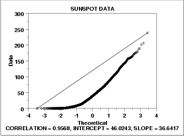
We can make the following conclusions from the above plot.
- The normal probability plot shows a strongly non-linear pattern. Specifically, it shows a quadratic pattern in which all the points are below a reference line drawn between the first and last points.
- The normal distribution is not a good model for these data.
This quadratic pattern in the normal probability plot is the signature of a significantly right-skewed data set. Similarly, if all the points on the normal probability plot fell above the reference line connecting the first and last points, that would be the signature pattern for a significantly left-skewed data set.
In this case we can quite reasonably conclude that we need to model these data with a right skewed distribution such as the Weibull or lognormal.
References & Resources
- N/A
Latest Post
- Dependency injection
- Directives and Pipes
- Data binding
- HTTP Get vs. Post
- Node.js is everywhere
- MongoDB root user
- Combine JavaScript and CSS
- Inline Small JavaScript and CSS
- Minify JavaScript and CSS
- Defer Parsing of JavaScript
- Prefer Async Script Loading
- Components, Bootstrap and DOM
- What is HEAD in git?
- Show the changes in Git.
- What is AngularJS 2?
- Confidence Interval for a Population Mean
- Accuracy vs. Precision
- Sampling Distribution
- Working with the Normal Distribution
- Standardized score - Z score
- Percentile
- Evaluating the Normal Distribution
- What is Nodejs? Advantages and disadvantage?
- How do I debug Nodejs applications?
- Sync directory search using fs.readdirSync